This page is a companion for MUS2640 but is probably helpful for university work in general. You do not need to read it all at once; dip back in when you are planning a text or coming up to an exam.
Academic writing
Good writing (academic and other) start by having a clear idea of what you want to write about. If it is an assignment, the task is already given (compare, explain, argue, reflect, etc.). If not, you will need to decide yourself. You should also note word limits, deadline, format, and the citation style before you invest time in drafting. If anything is unclear, ask rather than assume something.
Planning saves time. Sketch a few bullet points for your main line of argument, then distinguish description from analysis, which means separating what something is from why it matters in context. For each section, know what evidence you will lean on: research articles, listening examples, or some of your own data.
A clear essay usually has an introduction that describes the context, the question you answer, and a one- or two-sentence summary. Then, each body paragraph should be built around one idea starting with a topic sentence, then some evidence backing up your argument, and finally a bridge forward to the next paragraph. Think of writing as creating an onion. You start with a core and develop layers that support that argument. You should end with a conclusion that knits the various threads you have vowen together and connect to your introduction. You may briefly note limits of your argument or what further research would be needed.
For voice, third person often fits analysis (“The results suggest…”), while first person is natural for reflection or methods when the assignment invites it. Prefer active phrasing when it clarifies who did what, and avoid drifting between voices without reason.
Writing about music
Writing about sound and music poses some challenges with connecting to the material you are describing. You can describe the sound with words and you can include visualisations (such as a spectrogram). It often also helps to link to a recording, but then be careful with describing the location you are describing (“at 1:42 in the Coltrane recording”), or bar numbers against a named edition if you are working from a score. “Later in the piece” is not an address.
Then describe before you interpret. Say what happens in terms someone could verify by listening, and only then say what you think it means. “The saxophone enters an octave above the previous phrase, and the bass drops out for four bars, which leaves the melody exposed at the point where the text turns” earns its conclusion. “The music becomes emotional here” does not, because there is nothing in it to check.
Keep your terminology fixed for the length of a text. Decide whether you are naming pitches by letter (C4), by solfège, or by scale degree, and stay with it. Decide whether “tempo” in your essay means the notated marking or the measured rate, and say which. If you use a term this book defines, such as timbre, metre, or masking, use it in that sense rather than the loose everyday one, and if you need the everyday sense, flag it.
When you are working from your own analysis, whether that is a spectrogram, a tempo curve, or a set of annotations, describe how you produced it. Which recording, which software, which settings. An analysis nobody can reproduce is an opinion with a figure attached.
Remember to cite anything that is not common knowledge, including paraphrases, quotations, and figures.
When you revise, use separate passes so you do not try to fix everything at once:
- Structure — does the argument flow from paragraph to paragraph?
- Claims and evidence — is each main point supported?
- Language and references — clarity, tone, and accurate citation.
Remember to format the text so that it looks coherent and is easy to follow. Use consistent font sizes, heading levels, indents, and spacings. Deliver nice-looking PDFs if you are not asked for something else.
Figures and plots
A figure should be readable on its own. Whether you make it yourself or borrow it, check that a reader could understand it without digging through your prose.
- Caption — Every figure needs a caption that says what the reader is looking at and what to notice, not just a repeated title. A good caption names the data and points to the takeaway (for example, “Spectrogram of a saxophone tone; note the evenly spaced harmonics”).
- Axes — Label both axes and give the units (Hz, dB, seconds, BPM). An unlabelled axis makes a plot almost meaningless.
- Legend and scale — If you show more than one series, add a legend. Explain tick values and any colour scale, and do not rely on colour alone to carry meaning.
- Readability — Use font sizes large enough to read at the size the figure will actually appear, and keep the design uncluttered.
- Reference and credit — Refer to each figure in the text (“Figure 3 shows…”) so the reader knows when to look, and cite the source if the figure is not your own.
The plots produced by the code examples in this book aim to follow these habits: labelled axes with units, and a caption that explains the content.
Referencing and source use
Avoid too many direct quotes in your writing. It is better to show that you can reformulate other people’s thinking in your own words. Use page numbers when you cite or paraphrase concrete things in other people’s texts.
There is no particular reference style asked for in this course. The most important is that you are consistent. Choose one (e.g., APA, Chicago, or Harvard) and stick to it. Use a reference manager (for example, Zotero) to keep track of your references. That will save you a lot of time later. In addition to helping with your references, it can serve as the start of your digital research library.
Use relevant databases for finding literature. Google Scholar is often the first place to start looking, but the university library is a better place to go for getting access to material behind paywalls.
Study technique
Most people learn more from short focused blocks (~30 minutes) and real breaks than from staring passively at the same page for hours. When you need depth, lean on a calm environment and leave digital distractions aside.
After reading a chapter, try one or more of these:
- Close the notes and write half a page in your own words.
- Explain a concept aloud as if to someone new to the topic.
- Turn each section heading into a question and answer it before you reread.
Since this course is all about listening and experiencing your sonic environments, turn on your senses in everyday life. Try to apply what you learn to what you experience.
Test out AI tools, if you like. Feel free to explore tools such as NotebookLM with this textbook to pose test questions.
Exam preparation
This course uses a school exam without any tools. That means that you will need to express yourself without any tools. The questions will not be made to test your memory, but to check whether you have understood the main concepts and how things relate.
The best preparation for the exam is to read through this textbook, show up in class, and do the assignments.
Also practice your general academic writing. This includes sharpening your language, including the use of key terms (e.g., differences between “sound” and “audio”).
During the exam, remember to answer the questions posed and set aside enough time to get through all the questions. If a question freezes you, begin with what you do know and return later. Partial answers usually earn more than blanks.
How to read a spectrogram
A spectrogram is a picture of sound. Time runs along the horizontal axis, frequency runs up the vertical axis, and brightness shows how much energy the sound carries at each point. A bright patch means strong energy at that frequency and that moment, while a dark patch means little or none. This page collects the essentials for reading such pictures, a skill you will use throughout the course.
The axes, slowly
It is worth being very precise about what each axis means, because a spectrogram is easy to misread.
The horizontal axis is time, exactly as in a waveform display or a timeline. Reading a spectrogram from left to right means moving through the recording from beginning to end. A vertical slice of the image is one moment of sound.
The vertical axis is frequency, measured in hertz. It is a physical quantity, the number of vibrations per second, not a note name. Low frequencies sit at the bottom, high frequencies at the top. The axis can be drawn in two ways. On a linear scale, the distance from 0 to 1,000 Hz is the same as from 1,000 to 2,000 Hz; this is the mathematical default, but it squeezes the musically important low range into a thin band at the bottom. On a logarithmic scale, every octave (doubling of frequency) gets the same amount of space, which matches how pitch works musically: the step from 220 to 440 Hz looks as big as the step from 440 to 880 Hz. Always check which scale you are looking at before interpreting anything.
The third dimension is colour or brightness, which shows how much energy the sound carries at that time and that frequency, usually on a decibel scale. A spectrogram is really a three-dimensional surface (time, frequency, energy) seen from above, with the height of the surface turned into colour. So a bright spot at two seconds and 440 Hz means: at that moment, the recording contained strong vibration at 440 cycles per second. Nothing more, nothing less.
A waveform display shows two of these dimensions (time and overall amplitude). The spectrogram unfolds the amplitude into its frequency content, which is why it shows so much more, and why it takes more care to read.
One note is many lines
The most common misreading is to treat a spectrogram as if it were a score or a piano roll. It is not, and the difference matters.
When a single voice or instrument plays a single note, the spectrogram does not show one line. It shows a whole stack of horizontal lines: the partials of the tone, at whole-number multiples of the fundamental frequency (see the terminology in acoustics). Play one note at 220 Hz on a guitar and you will see lines at 220, 440, 660, 880 Hz and upwards. To an eye trained on piano rolls, that stack looks like a large chord. It is one note. The pitch you hear corresponds to the lowest line (which is also the spacing between the lines), and everything above it shapes the timbre of the tone, not extra notes.
This is because a spectrogram shows the physical, composite structure of sound, while a note is a perceptual and cultural unit. The auditory system fuses the whole harmonic stack into a single heard tone; the spectrogram leaves it unfused for you to inspect. Two practical consequences follow. First, to find the melody in a spectrogram, follow the lowest strong line of a stack (or the spacing of the stack), not every line. Second, when several instruments play together, their stacks interleave, and untangling which line belongs to which source becomes genuinely difficult. That difficulty is not a flaw in the picture; it is the same problem your auditory system solves in auditory scene analysis (psychoacoustics), and the reason automatic music transcription remains hard (machine listening).
A quick test when you are unsure whether a stack is one note or a chord: check the spacing. The partials of a single harmonic tone are equally spaced in hertz (220, 440, 660: always 220 apart). The fundamentals of a chord are not; a major triad on A has fundamentals at 220, 277, and 330 Hz, and each of those carries its own stack above it.
For a video walk-through of the same ideas, this short introduction from the National Music Centre is a good complement to the text:
What common sounds look like
A harmonic sound, such as a sung vowel or a plucked guitar string, appears as a stack of horizontal lines. The lowest line is the fundamental frequency, which normally matches the pitch you hear, and the lines above it are harmonics at whole-number multiples of the fundamental.
A drum hit or click appears as a thin vertical stripe. The event is short in time but spreads its energy across many frequencies at once, so it paints the whole height of the image for an instant.
A voice or instrument with vibrato shows the familiar harmonic stack, but each line waves gently up and down. The waves trace the periodic pitch variation, and they are easiest to spot in the upper harmonics, where the movement is magnified.
Noise, such as a cymbal wash, wind, or hiss, appears as a diffuse wash of energy without clear lines, because the energy is spread continuously across the frequency range.
Silence appears as darkness. In practice a recording is rarely completely dark, since background noise usually leaves a faint glow near the bottom of the image.
The figure below shows all of these in a single synthesised clip.
Source
# Annotated spectrogram of a synthesised clip with a count-in click,
# a harmonic tone with vibrato, a noise burst, and silence
import numpy as np
import librosa
import librosa.display
import matplotlib.pyplot as plt
plt.rcParams.update({
    "font.size": 10,
    "axes.titlesize": 11,
    "axes.labelsize": 10,
    "xtick.labelsize": 9,
    "ytick.labelsize": 9,
    "legend.fontsize": 9,
    "figure.figsize": (10, 4),
    "figure.dpi": 100,
    "savefig.dpi": 150,
    "axes.spines.top": False,
    "axes.spines.right": False,
})

rng = np.random.default_rng(2640)
sr = 22050
duration = 6.0
n = int(sr * duration)
t = np.linspace(0, duration, n, endpoint=False)
y = np.zeros(n)

# Count-in clicks: two short broadband bursts
for start in (0.4, 0.9):
    idx = (t >= start) & (t < start + 0.012)
    y[idx] += 0.9 * rng.uniform(-1, 1, idx.sum())

# Sustained harmonic tone with vibrato (f0 = 220 Hz, 5.5 Hz vibrato)
f0, vib_rate, vib_depth = 220.0, 5.5, 8.0
inst_f0 = f0 + vib_depth * np.sin(2 * np.pi * vib_rate * t)
phase0 = 2 * np.pi * np.cumsum(inst_f0) / sr
tone = np.zeros(n)
for k in range(1, 7):
    tone += (0.5 / k) * np.sin(k * phase0)
env = np.where((t >= 1.5) & (t < 3.8), 1.0, 0.0)
ramp = int(0.05 * sr)
attack = np.searchsorted(t, 1.5)
release = np.searchsorted(t, 3.8)
env[attack:attack + ramp] *= np.linspace(0, 1, ramp)
env[release - ramp:release] *= np.linspace(1, 0, ramp)
y += 0.6 * tone * env

# Noise burst
idx = (t >= 4.2) & (t < 4.8)
y[idx] += 0.35 * rng.uniform(-1, 1, idx.sum())

# Silence from 4.8 s onwards (nothing added)
y = y / np.max(np.abs(y))

n_fft, hop_length = 2048, 256
D = librosa.stft(y, n_fft=n_fft, hop_length=hop_length, window='hann')
S_db = librosa.amplitude_to_db(np.abs(D), ref=np.max)

fig, ax = plt.subplots(figsize=(10, 4.2), constrained_layout=True)
img = librosa.display.specshow(S_db, sr=sr, hop_length=hop_length,
                               x_axis='time', y_axis='hz', cmap='magma', ax=ax)
ax.set_ylim(0, 2500)
ax.set_title('An annotated spectrogram of a six-second synthesised clip')
fig.colorbar(img, ax=ax, format='%+2.0f dB')

notes = [
    ('count-in clicks:\nvertical stripes', (0.65, 1900), (1.15, 2300)),
    ('harmonics:\nhorizontal stack', (2.6, 480), (2.05, 2050)),
    ('vibrato:\nwavy lines', (3.3, 1310), (3.85, 1850)),
    ('noise burst:\nbroadband wash', (4.5, 1500), (4.35, 2250)),
    ('silence:\ndarkness', (5.5, 900), (5.15, 1500)),
]
for text, xy, xytext in notes:
    ax.annotate(text, xy=xy, xytext=xytext, color='white',
                ha='center', va='center',
                arrowprops=dict(arrowstyle='->', color='white', lw=1.2))
plt.show()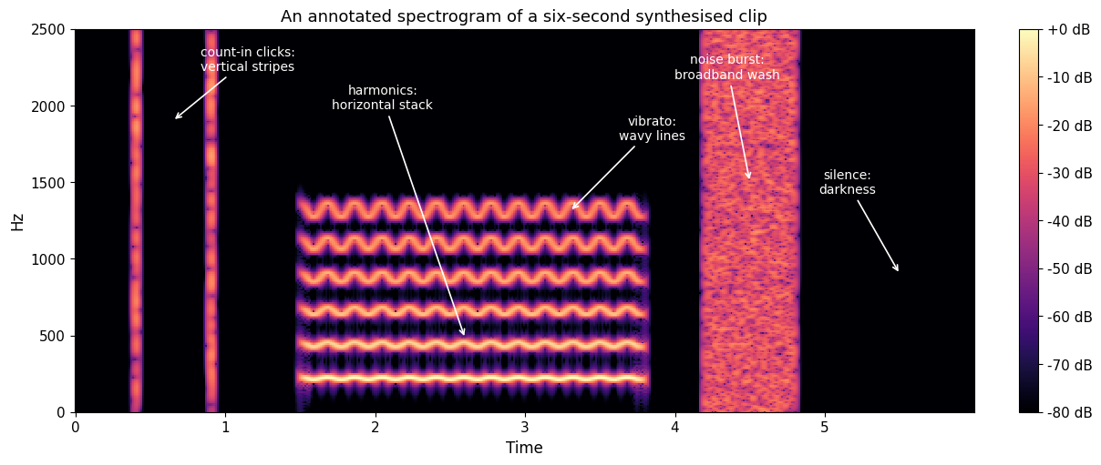
The window-size trade-off
Every spectrogram is computed with an analysis window, and the window size sets a trade-off: a short window is sharp in time but blurry in frequency, while a long window is sharp in frequency but blurry in time. The acoustics chapter explains this trade-off in more detail and shows the same signal analysed with three window sizes.
Checklist when describing a spectrogram
- Start with the axes: note the time span, the frequency range, and whether the frequency and intensity scales are linear or logarithmic.
- Identify the obvious events: where does something clearly begin, end, or change?
- Sort the content into harmonic (horizontal lines), percussive (vertical stripes), and noisy (diffuse washes).
- Describe how the sound develops over time: what stays constant and what moves?
- State what you cannot conclude: a spectrogram shows physical energy, not perceived loudness, and it does not by itself reveal which instrument or source produced the sound.
Making spectrograms in Sonic Visualiser
Sonic Visualiser is the tool used for spectrogram work in this course. Open an audio file (File > Open) and you first see a waveform. Spectrograms are added as layers on top: open the Layer menu and you will find three different spectrogram types. All three are computed from the same analysis; they differ in what they choose to show.
The regular spectrogram
Layer > Add Spectrogram (shortcut G) gives the standard, general-purpose view: all frequencies from 0 Hz to half the sampling rate, with energy as colour. This is the view to start from. It shows everything at once: harmonic stacks, percussive stripes, and noise washes. Its weakness is the linear frequency default, which devotes most of the image to high frequencies where relatively little music happens.
The properties pane on the right edge is where the important choices live. Window sets the analysis window size and with it the time-frequency trade-off described in acoustics: 1024 samples is a reasonable general default, longer (2048 or 4096) for sustained tones and fine pitch detail, shorter (256 or 512) for drum hits and onsets. Scale switches the colour mapping (dB is usually the most readable). The frequency axis can be switched between linear and logarithmic, and vertical zoom (the wheels at the bottom right of the pane) lets you concentrate on the range that matters.
The melodic range spectrogram
Layer > Add Melodic Range Spectrogram (shortcut M) is a preset of the same analysis tuned for following melody. It restricts the view to a melodic frequency range, uses a logarithmic frequency axis so that octaves get equal space, and uses a longer window for better frequency resolution. Pitch contours, vibrato, and slides read almost like a drawn melodic line. This is usually the best view for questions such as where a melody rises and falls, or how wide a singer’s vibrato is. Remember from the section above that even here, one sung note appears as several parallel lines; the melodic contour is the lowest strong one.
The peak frequency spectrogram
Layer > Add Peak Frequency Spectrogram (shortcut K) changes what is drawn. Instead of smearing each detected component across the width of an analysis bin, it estimates the precise frequency of the strongest component in each bin and draws a thin line exactly there. Harmonic partials become crisp, needle-thin traces whose frequencies can be read off accurately, which makes this the view for questions about tuning, exact harmonic frequencies, or whether two lines are really one. The price is that the picture is only meaningful where there are clear peaks: noise and reverberation, which genuinely are smeared across frequency, come out looking strange and speckled.
Which one when
For an overview of a whole recording, use the regular spectrogram; for following pitch and melody, the melodic range spectrogram; for precise frequency measurement of clear tonal sounds, the peak frequency spectrogram. It is often instructive to keep two of them as layers in the same pane and toggle between them (the layer tabs at the top of the properties pane), because the differences between the views teach you what each one hides.
This video demonstrates working with spectrogram properties in Sonic Visualiser on real performance recordings, including the trade-offs between time- and frequency-sensitive settings: